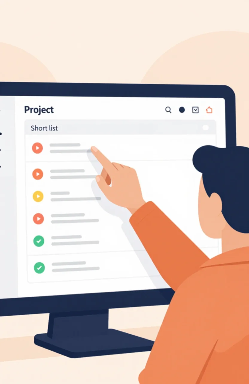
Buyers skim directory cards in seconds. They rarely read your full pitch first. They look at the screenshot. If the image is a blurry dashboard crop, a logo on white, or a random marketing hero with no product in sight, they scroll past. Your title can be sharp and your coupon fair, and you still lose the click because the visual never proved the product.
This guide is about visual assets on a project directory listing: what to show, how large to export, how to write alt text, and which order to stack images. It is not a copywriting lesson on titles and descriptions. Those matter, but screenshots do a different job. They answer one question fast: “Is this real, and does it look like something I can use today?”
What a converting screenshot actually shows
A converting screenshot is not a pretty brand mood board. It shows the product doing work. Aim for one primary image that communicates outcome in a glance, then support images that remove doubt.
Show the UI people will live in
Capture the main screen after login, not the marketing landing page. Founders often upload the homepage hero because it looks polished. Directory browsers already know how landing pages look. They want the tool: the editor, the dashboard, the map, the inbox, the board.
Crop tightly around the useful region. Remove empty sidebars if they steal focus. Keep enough chrome so the product feels real, but do not leave a 4K desktop wallpaper behind a tiny widget.
Show an outcome, not only chrome
Whenever possible, include a finished result inside the frame: a generated report, a ranked list, a completed workflow, a chart with a clear spike, a published page. Outcome beats empty states. Empty states look unfinished even when your product is ready.
If your tool is an AI product, show an input and a useful output in the same frame. If it is analytics, show a readable insight. If it is a marketplace or directory of its own, show a filled results page.
Include a light pricing cue when it helps
You do not need a full pricing table in every image. A small, honest cue helps: a visible Free plan badge in the UI, a trial counter, or a clear Pro label on a feature the screenshot highlights. Pricing cues reduce “is this enterprise-only?” fear without turning the image into an ad.
Avoid fake urgency overlays, giant SALE stamps, or watermarks. Directory pages already have coupon slots. Let the coupon handle the offer. Let the screenshot handle proof.
Size, format, and technical basics that protect quality
Directories compress images. Start from a sharp source so compression does not destroy detail.
- Export width around 1280 to 1600px for primary screenshots. Smaller files look soft in cards. Huge 4K files slow uploads and get crushed anyway.
- Use PNG for UI with sharp text edges and flat colors. Use high-quality JPEG or WebP for photo-heavy scenes.
- Keep aspect ratios consistent across your gallery so the listing does not jump between tall and wide crops.
- Avoid browser UI chrome (bookmarks bar, extensions, OS dock) unless it is part of the story. It dates the shot and wastes pixels.
Retina displays make soft screenshots obvious. If your UI text looks fuzzy at card size, recapture at a higher device scale or use a clean browser zoom before export.
When you manage assets inside ListYourProject, upload from My Websites after you create the project so you can refresh images without rebuilding the listing from scratch.
Alt text that helps without stuffing keywords
Alt text is for accessibility and for context when images fail to load. Write one plain sentence that describes what is on screen.
Good: “Project dashboard showing weekly referral traffic chart and active coupon list.”
Weak: “Best SEO SaaS tool directory listing screenshot backlinks 2026.”
Name the product once if it helps recognition, then describe the visible UI. Skip keyword lists. Screen readers and humans both hate them.
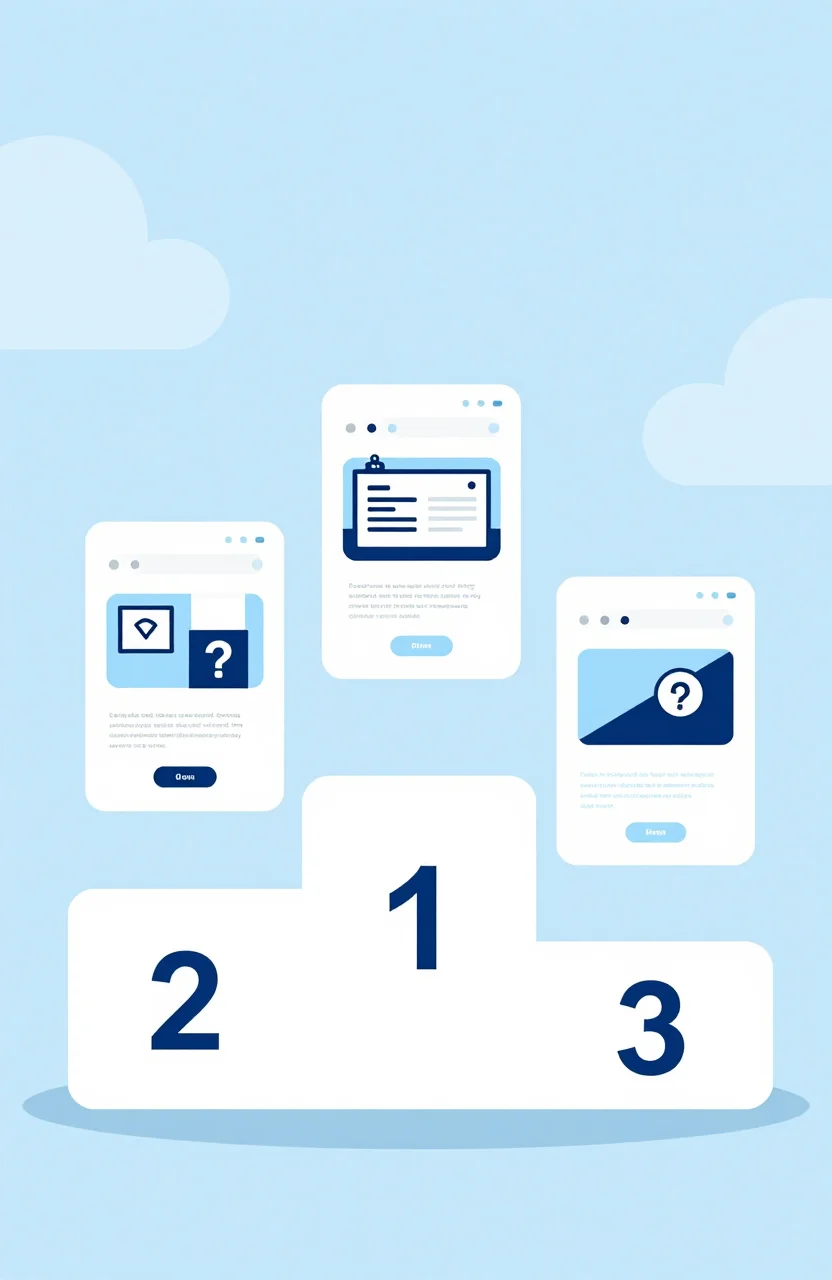
Image order on the listing: lead with proof
Order is strategy. Put your strongest proof first.
- Primary: main product UI with a clear outcome.
- Second: a workflow step or detail view that shows depth.
- Third: pricing cue, mobile view, or before/after if relevant.
- Optional fourth: integration or export screen for technical buyers.
Do not lead with a logo lockup. Do not lead with a team photo. Do not lead with a conference booth shot. Those belong on an About page, not the first card impression in a project directory.
If you only have one strong screenshot, ship that one. One clear image beats five mediocre crops. Add more only when each image answers a new objection.
Common screenshot mistakes that kill clicks
These show up constantly on weak listings:
- Dark mode screenshots that crush into muddy cards on light directory themes.
- Placeholder data, lorem ipsum, or “John Doe” demo content that looks fake.
- Busy multi-monitor captures where nothing is readable at thumbnail size.
- Annotated arrows and giant callout bubbles covering the UI.
- Expired UI from two redesigns ago that no longer matches the live product.
Fix the easy ones first. Use realistic sample data. Prefer light, high-contrast UI for directory cards even if your app also supports dark mode. Update screenshots when you ship a major UI change so referral visitors are not surprised.
A simple production workflow you can reuse
Treat screenshots like product assets, not last-minute exports.
- Create a staging account with clean demo data that looks like a real customer.
- Capture three candidate frames for the primary shot and pick the clearest at thumbnail size.
- Export, compress lightly, write alt text, and upload in the order above.
- Click your own listing on a phone and a laptop. If you cannot read the main action, recrop.
When you are ready to publish a fresh listing, create your account, add the project, then iterate on images the same week you refine copy. Visuals and words should agree. If the screenshot shows a reporting tool and the description talks like a CRM, buyers bounce.
Screenshots will not replace a good product. They will decide whether busy founders give you the two seconds needed to learn more. Make those two seconds count.